Clickbait Snail Mail
How companies try to get me to open the mail they send
Oct 19, 2019 · 999 words · 5 minutes read
Junk mail is so interesting at its odd intersection between design, advertising, and psychology.
I usually try to pay attention to the ways that things around me are designed, and recently I’ve been saving some junk letters that are particularly interesting in their attention-grabbing efforts. Here are a few of the notable envelopes I’ve received in the past few months.
What if we didn’t put any information on it and made it look exotic?
Here’s a letter I received with a colorful design and no information:
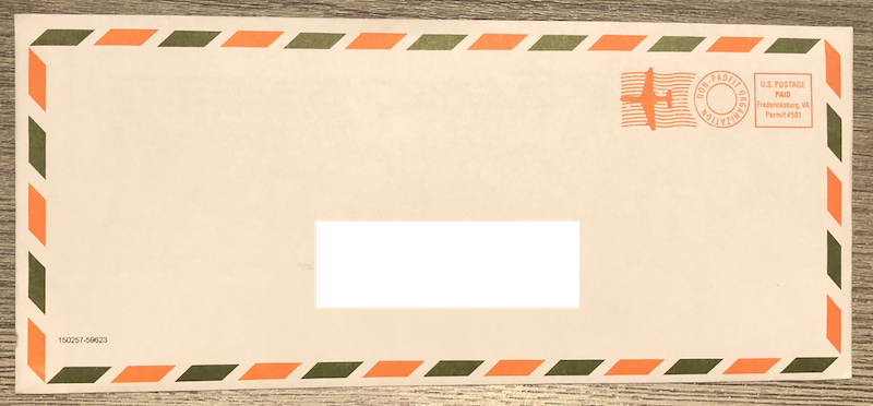
You can tell by the pixelation that it’s all just printed on, and it’s actually a request for donations for a company that provides loans (but not donations?) to farmers in Africa.
There are a few things that this design does.
No return address: I don’t immediately know it’s junk from a non-profit, and it could be from someone I know. This could make me less likely to toss it immediately.
Air mail stamps and old school border design: makes it look more interesting than your usual mail, which adds to the allure. Best case scenario it was really routed through Brussels.
What can we do with color?
Next up is a bright blue letter that stood out from its all-white neighbors.
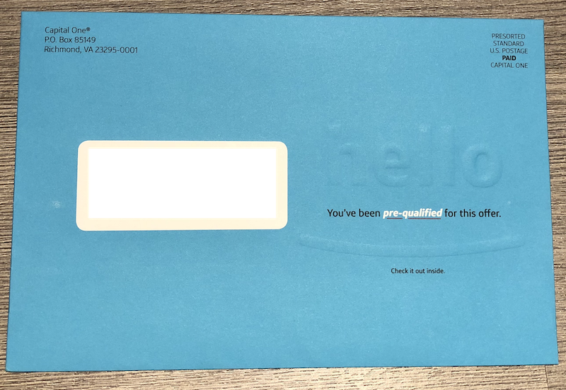
Bright blue color and embossed “hello”: these catch your eye with color and texture.
Pre-qualified: classic.
Lower case “hello”: signaling that it’s casual, not just corporate.
Mailing to people who registered dogs in Cambridge
I got a political mailer that stood out to me. It’s less about opening a letter, but it’s still advertising.
Dog-focused: they clearly know I have a dog, so they sent me the dog mailer.
Photo with a dog: Craig is clearly dog-friendly.
Endorsed by Mass Voters for Animals and Sierra Club: lots of positive signaling.
Save a child and get a map
This letter asks for your help and shows you a child that you could help. They also advertise a free gift, which is oddly a map of the United States.
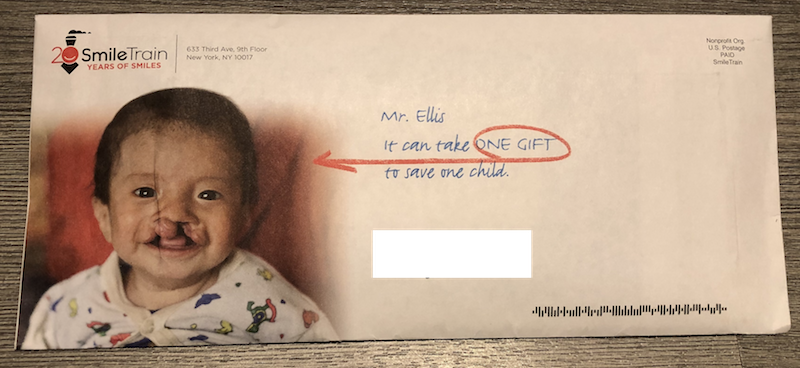
Personalized: this is no “To Whom It May Concern”; it’s you that can help, and they call that out.
Showing you a child you can help: this helps make the issue real, since you can directly see who you could help.
Free map: this one is pretty odd to include, but when you get a gift by just opening the letter, opening the letter becomes even more appealing.
Action required for your electricity account
I have an account with Eversource, the utilities company that provides the electricity I’m using to write this, and I received this letter from another company, which is importantly not Eversource.
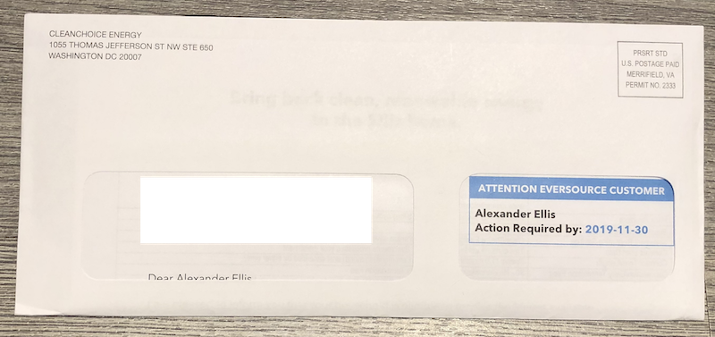
Attention Eversource Customer
Action Required by: 2019-11-30: this vague notice about a required action is a ploy to get you to open the letter, since you’d would want to know about any issue with your utilities immediately. The “required” action is actually just a deadline for a special rate to switch your electricity to be from clean energy. Important, but surely not required.
Offering offers
This one’s a classic: offering a limited time bonus for signing up and displaying it prominently.
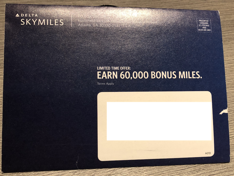
30,000 60,000: Double the miles! Except it’s a little unclear if the usual offer is 30,000. This is something you could easily just say, like raising a price before a “sale”.
Limited time offer: classic. Better act fast.
Float Away/photo of pool/Implying “This could be you.”: Yeah right, maybe if I looked good in a one-piece.
Keep it simple: just tell me to look inside
SoFi keeps it simple and adds some text that could easily be taken straight from a clickbait article:
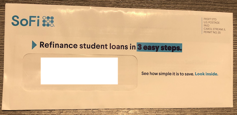
Slight hyperbole
Coming soon on FiveThirtyEight: Christmas catalog power rankings.
Discounts and visible gift cards
I found this one interesting. It’s pretty common to give a special deal for signing up, and this front is no different. What sets this apart is the back of the envelope; it’s semi-translucent, and you can see the gift cards within.
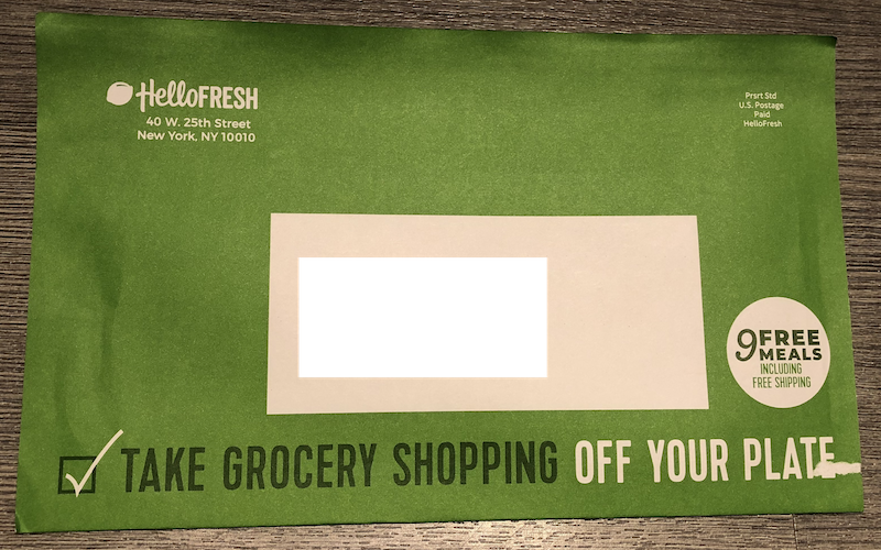
9 Free Meals including free shipping: Classic free stuff, including free shipping.
Take grocery shopping off your plate: fun meal pun, fun meal company.
Visible gift cards: this gives an extra appeal of “I can see those and I want them.” They’re physical gift cards, which makes the discounts feel even realer.
I wonder how much more expensive this is to make?
Notable mentions not featured here
There are a few that I’ve gotten in the past but haven’t saved since I thought of doing this:
- Mailing me a nickel and putting it in clear plastic so I can see it
- Credit card offer that looks like a check (including the tearable sides like a pressure sealed check)
- Credit card offer that was just a manila envelope with no return information
What’s the point?
I’ll preface this by saying I have no familiarity with advertising by mail, so the following is all speculation.
In these examples, we can see a huge push just to get you to even open the letter.
I would imagine that there’s a huge drop off in the recipient pipeline between receiving the letters and opening, then another big drop between opening and following through (signing up, sending donations, etc). There’s no tracking pixel that will report back that I’ve opened their letter, but I could see some A/B testing where they keep the contents the same and vary the envelope, or vice-versa, then see if the recipient was more or less likely to follow through.
In that lens, I could imagine these being ways to improve the open-rate, but at what cost? Like an ad click that doesn’t end up in a sale, I could see some of these resulting in more open envelopes, but it feels like a race to the bottom. At least it gives us an interesting view into how they’re designing these envelopes to be opened.
I’ll keep my eyes out for any interesting ones in the future. In the mean time, I’ll be here enjoying my free gifts.